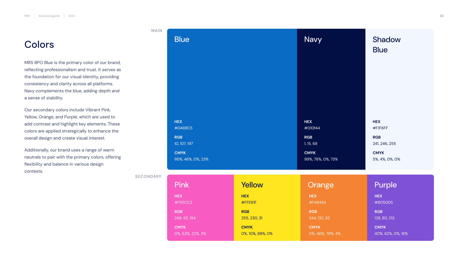

At the heart of MRS BPO’s new branding is its primary color—MRS BPO Blue. This signature shade symbolizes professionalism and trust, serving as the foundation of the brand’s visual identity. Complementing the primary blue is Navy, which adds depth and stability, reinforcing the brand’s reliability.
To introduce contrast and dynamism, a set of secondary colors—Vibrant Pink, Yellow, Orange, and Purple—were strategically implemented. These colors highlight key elements, ensuring visual interest while maintaining a balanced aesthetic. Additionally, warm neutrals were incorporated to pair with the primary colors, offering flexibility in various design contexts.